I bumped into UI spotlighting a couple of times throughout my career. You know the pattern: dim the screen, cut a hole around something important, make the user look at it. Onboarding flows and feature discovery, mostly. The concept is dead simple. Somehow there’s no production-ready open-source solution for it in SwiftUI.
The first time was years ago while working on a US-based retailer’s iOS app. We needed to emphasize when a user adds something to the cart for the first time. A spotlight with a dim overlay was one option, an animation was another. We ended up going with the animation, but that’s when I first discovered blendMode.
The second time was a different app, different company. This one needed a full interactive onboarding flow: highlight a button, wait for the user to tap it, advance to the next step, highlight something else. Walk first-time users through the app’s core features, one spotlight at a time. This required real infrastructure. Tagging arbitrary views, reading their positions, rendering an overlay with cutouts, coordinating a multi-step sequence. It was a proper build.
The idea was simple. The implementation was not.
Then it came up a third time. Different project, simpler requirement. A short sequence — three or four spotlights, nothing like the full onboarding beast from the second project. I looked at the code from that second build and thought: I’m not copy-pasting this mess again. If I keep rebuilding this every couple of years, I might as well extract it into a framework and open-source it.
The result is Beacon.
The Core: Blend Modes, Compositing Groups, and Punching Holes
Every spotlight overlay needs the same thing: a dimmed layer covering the screen with transparent cutouts revealing the content underneath. There are different ways to achieve this. I tried a Canvas-based approach with the even-odd fill rule early on (more on that later). But the approach that stuck, and the one behind most spotlight implementations I’ve seen, is blendMode(.destinationOut) paired with compositingGroup().
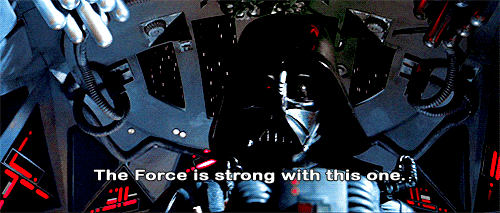
CGBlendMode has been part of CoreGraphics for ages. It contains the Porter-Duff compositing modes along with various other blend modes. In 1984, Thomas Porter and Tom Duff at Lucasfilm published a paper on alpha compositing that defined how two image layers combine pixel-by-pixel based on their alpha channels. Forty years later their math is still the foundation of every compositing engine on every platform. The Force is clearly strong with this one.
(Android calls theirs PorterDuff.Mode. Imagine being new to Android graphics and reading that class name for the first time with zero context.)
.destinationOut is one of those Porter-Duff modes. It defines how the source (what you’re drawing) combines with the destination (what’s already there). The formula: R = D * (1 - Sa). Wherever the source is fully opaque, the destination gets completely erased. Wherever the source is transparent, the destination stays intact. Draw an opaque shape, and it punches a hole in whatever was already rendered beneath it. The shape itself becomes invisible. It doesn’t add pixels, it removes them. Some call it “reverse masking” because .mask() and .destinationOut are inverses.
// A dimmed overlay with a transparent circular cutout
ZStack {
    Color.black.opacity(0.55)       // Full-screen dim
    Circle()
        .fill(.white)
        .frame(width: 100, height: 100)
        .blendMode(.destinationOut) // Erase the dim layer here
}
.compositingGroup()
That .compositingGroup() at the end is doing the real work. Here’s why.
A ZStack is not a rendering boundary. It doesn’t have its own pixel buffer. It’s purely a layout coordinator. When it’s time to draw pixels, each child draws directly into the shared screen buffer. The ZStack just tells them where to go.
So .destinationOut doesn’t target the dim layer specifically. It targets the destination, which is the entire screen buffer, everything already drawn. If the circle’s bounds overlap with a Text("Hello World") rendered earlier in the hierarchy, those text pixels get erased too. The blend mode punches right through the ZStack boundary because, from the renderer’s perspective, there is no boundary.
compositingGroup() fixes this by creating a real rendering boundary, an offscreen buffer. Everything inside the ZStack draws into this private buffer first. The circle’s .destinationOut can only erase what’s in that buffer (the dim layer), and once compositing is done, the result is flattened into a single image and placed onto the screen. Under the hood, this tells the backing CALayer to allocate an offscreen texture, render all sublayers into it, then composite it as a group separate from its parent. One extra render target, one extra compositing pass.
Without compositingGroup(), the blend mode leaks through and erases things it shouldn’t. The ZStack needs its own pixel sandbox, and that’s what this modifier gives it.
The First Build: Preferences, Anchors, and Why It Broke
The rendering was the easy part. Getting the cutout positions right was where it got messy.
I needed to tag views anywhere in the hierarchy, then read their frames at the overlay level. The approach I used was SwiftUI’s preference system: child views report their geometry up the tree, a parent view reads all the reports and renders the overlay.
The implementation used transformAnchorPreference to tag views and overlayPreferenceValue on a parent to read them. Anchor<CGRect> is a deferred coordinate reference, a token that says “I represent this view’s bounds, resolve me later.” The parent resolves it in its own coordinate space via geometry[anchor]:
// Child: tag with deferred bounds
.transformAnchorPreference(key: HighlightPreference.self, value: .bounds) {
    $0[viewKey] = $1  // Anchor<CGRect>, not a resolved CGRect
}

// Parent: resolve and render
.overlayPreferenceValue(HighlightPreference.self) { targets in
    GeometryReader { geometry in
        let frame = geometry[targets[viewKey]!]  // Resolved in parent's local space
        // Position cutout at frame
    }
}
Was Anchor strictly necessary here? You could use .global coordinates with a regular PreferenceKey and subtract the parent’s global origin manually. Anchor just makes it so neither side has to think about coordinate conversion. A nice ergonomic win, but not essential.
The real problem was the overlay itself. It was a SwiftUI .overlay() on whatever parent view I applied overlayPreferenceValue to. That overlay only covers that view’s bounds. The moment you need to spotlight something near a TabBar (which lives outside any individual tab’s view hierarchy) or during a sheet presentation (a new presentation context above the original view), the overlay can’t reach it.
And complexity kept piling on. Tooltips needed their own cutouts. Then someone wanted remote-configurable content. Then delay modes, analytics hooks, arrow shapes pointing from tooltip to target. It worked, but with enough leaky abstractions that every new requirement meant fighting the existing code as much as writing new code.
At some point I was writing workarounds for my own workarounds. Time to throw it out and start over.
A Canvas Detour
When I started building the framework, I wanted to strip off every bit of accumulated complexity. I ditched blendMode + compositingGroup entirely in favor of a Canvas view with FillStyle(eoFill: true), the even-odd fill rule.
Canvas { context, size in
    var path = Path()
    path.addRect(CGRect(origin: .zero, size: size))       // Full screen
    path.addRoundedRect(in: cutoutFrame, cornerSize: ...) // Cutout
    context.fill(path, with: .color(.black.opacity(0.55)), style: FillStyle(eoFill: true))
}
Areas enclosed by an odd number of path boundaries get filled. Even number? Empty. Full-screen rect = 1 boundary (filled). Cutout inside it = 2 boundaries (empty). Single draw call, no compositing group, no blend mode. And since it’s one fill operation regardless of how many cutouts you need, it should theoretically perform better too.
Then I needed smooth animations. The cutout sliding from one target to the next.
Canvas is an immediate-mode drawing context. Its renderer closure runs every time the view needs to redraw. It’s normal imperative code, not a view builder. SwiftUI’s .animation() works by interpolating between view property values across frames, but Canvas doesn’t have properties that SwiftUI can interpolate. It has a draw() closure that executes procedurally. Putting .animation(.spring(), value: frame) on a Canvas does nothing useful.
Back to blendMode(.destinationOut) it was. With RoundedRectangle as a proper SwiftUI view, frame changes are animatable properties. The cutout slides smoothly between targets because SwiftUI can interpolate .position() and .frame() values over time.
The Framework: UIWindow, Global Coordinates, Sequences
The overlay uses a UIWindow at windowLevel = .alert + 1. This sits above everything the system renders: tabs, sheets, modals, nav bars. Touch handling is done by overriding hitTest on a custom window subclass. When nothing is presenting, all touches fall through to the app. When a spotlight is active, touches route to the overlay. Tap the dim area to dismiss, tap the cutout to advance.
Moving the overlay to a UIWindow also collapsed the coordinate space problem. A UIWindow’s local coordinate space IS the screen’s global coordinate space. So onGeometryChange with .global gives you frames directly usable by the overlay:
.onGeometryChange(for: CGRect.self) { proxy in
    proxy.frame(in: .global)
} action: { frame in
    Beacon.coordinator.register(identifier, frame: frame, ...)
}
No Anchor, no PreferenceKey, no coordinate transformation. The child reads its global frame, sends it to the coordinator, and the overlay window uses it as-is.
The overlay view itself is the same ZStack + blendMode + compositingGroup pattern, with RoundedRectangle cutouts positioned from the coordinator’s target registry:
ZStack {
    style.color.opacity(style.opacity)
        .onTapGesture {
            coordinator.handleInteraction(.tappedOutside)
        }

    RoundedRectangle(cornerRadius: region.cornerRadius)
        .fill(.white)
        .frame(width: frame.width, height: frame.height)
        .position(x: frame.midX, y: frame.midY)
        .blendMode(.destinationOut)
        .animation(animation, value: frame)
}
.compositingGroup()
.ignoresSafeArea()
That .animation(animation, value: frame) on the cutout is what makes sequence transitions smooth. When the active target changes, SwiftUI interpolates the position and size to the new frame.
The coordinator is an @Observable @MainActor class. It holds a target registry mapping identifiers to frame, shape, and padding, plus presentation state and interaction routing. Views register themselves via .beaconTarget() modifiers. The coordinator doesn’t know or care about the view hierarchy. Just a dictionary of frames.
The sequence runner is an async while loop over steps. At each step it updates the coordinator’s active identifiers, shows the window, then suspends via CheckedContinuation until the user taps something:
private func runSequence(_ sequence: BeaconSequence) async {
    var index = 0
    while index < sequence.steps.count {
        guard !Task.isCancelled else { break }
        let step = sequence.steps[index]

        coordinator.updateActiveIdentifiers(step.targets, ...)
        windowManager.showIfNeeded()

        guard let interaction = await waitForInteraction() else { break }

        // Handle tap behavior: advance, dismiss, or custom
        ...
        index += 1
    }
}

private func waitForInteraction() async -> BeaconInteraction? {
    await withCheckedContinuation { continuation in
        self.interactionContinuation = continuation
    }
}
When the user taps the cutout, the coordinator’s interaction handler resumes the continuation. The loop advances. stop() resumes with nil to break out. CheckedContinuation is the bridge between user taps and async/await here.
Sequences are built with a result builder DSL:
Beacon.Sequence.run {
    BeaconStep("welcome-button")
    BeaconStep("profile-tab", tapBehavior: .advance)
    BeaconStep("settings-icon", dimmedTapBehavior: .ignore)
}
Swift Concurrency
I spent some time thinking about how to properly use Approachable Concurrency in this framework. Actors, Sendable boundaries, isolation inference. The Package.swift enables NonisolatedNonsendingByDefault and InferIsolatedConformances.
But Beacon is a UI overlay framework. Everything runs on MainActor. The whole “complex” concurrency story boils down to: await user taps between sequence steps, don’t crash if someone cancels a Task.
I removed defaultIsolation(MainActor.self) from the Package.swift at some point. It felt wrong for readability. Explicit @MainActor annotations on each type make the isolation obvious for anyone reading the source. I want people to see the isolation at the declaration site, not have to check the package manifest. Value types like BeaconRegion and BeaconStyle are Sendable without actor isolation, and a module-wide default would’ve unnecessarily pinned them to MainActor too.
What’s Next
The core spotlight and sequence flow works. TipKit integration is next: consumers would use Apple’s Tip system for the tooltip content while Beacon handles the visual focus.
The framework is on GitHub.
References
- Porter-Duff Compositing (Alpha Compositing), Wikipedia
- CGBlendMode, Apple Developer Documentation
- BlendMode.destinationOut, Apple Developer Documentation
- compositingGroup(), Apple Developer Documentation
- CALayer.allowsGroupOpacity, Apple Developer Documentation
- Canvas, Apple Developer Documentation
- Add rich graphics to your SwiftUI app, WWDC21
- Even-odd Fill Rule, Wikipedia
- transformAnchorPreference(key:value:transform:), Apple Developer Documentation
- overlayPreferenceValue(::), Apple Developer Documentation